We build a complete visual identity for you including the logo, colors, fonts, and a clear usage guideline — an identity used consistently everywhere your company appears, not just a standalone logo with no system behind it.
Start your visual identity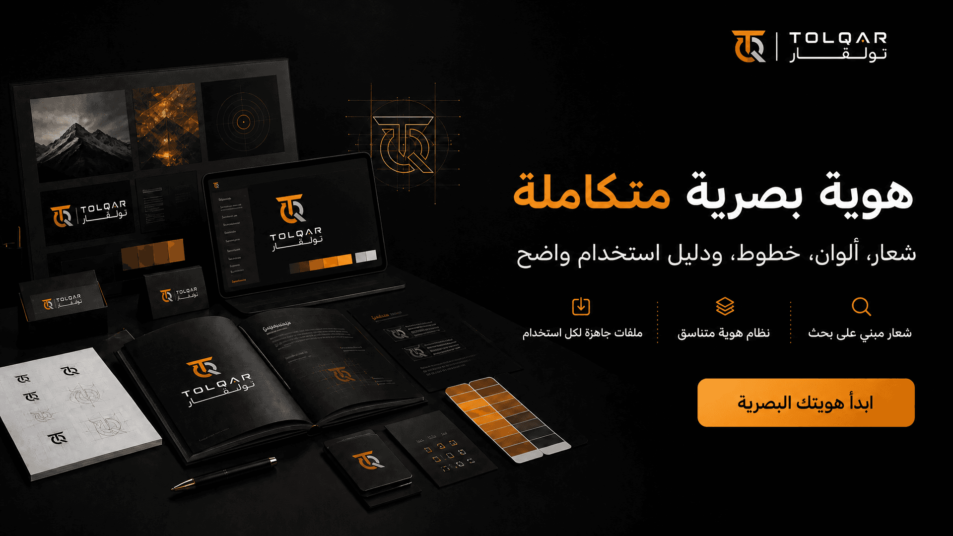
Many companies start with a quick logo without a clear system behind it, and after a period discover that every new design (business card, social media post, website) looks like it is from a different company. The reason is often the absence of a unified brand identity guide that precisely defines colors, fonts, and the method of using the logo. We build you a complete identity from scratch: a well-studied logo that reflects the nature of your business, colors and fonts connected to each other with clear logic, and a usage guide that ensures any designer working on your company in the future maintains the same visual consistency without needing to reinvent the identity all over again.
Before we start designing, we study the nature of your business and target audience, and look at how you position yourself compared to your direct competitors. This makes the final logo a well-thought-out decision that reflects your company's actual personality, rather than just an attractive shape with no meaning behind it or real connection to your field of work.
Logos, colors, and fonts are not designed in isolation—every element is built to harmonize with the rest using a clear rationale. This means that any new design you create later (a post, banner, presentation) looks like a natural extension of the same identity, not a separate piece from it.
We deliver a clear file explaining when to use each version of the logo, the permitted spacing around it, and the accepted color combinations. This guide ensures that any designer working on your company in the future will maintain the same identity without needing to ask you or reinvent it from scratch.
You receive the logo in multiple formats (transparent for digital designs, vector for printing at any size without losing quality) instead of needing to return to a designer every time you want to use the logo in a new context. This saves you time and additional cost in the future.
We design a light version for dark backgrounds and a dark version for light backgrounds, in addition to a minimized version suitable as an app icon or Favicon. This ensures that your logo appears clear and readable wherever it appears, instead of getting distorted or disappearing on an unsuitable background.
Every element of the identity is built specifically for the nature of your business; we do not rely on ready-made templates where we only change the colors. This reduces the likelihood of your identity resembling other companies that used the same template, and gives you real visual distinction in your field.
We offer two free revision rounds on the chosen direction after you see the first draft. This gives you enough time to make sure the logo truly reflects the image you want for your company, instead of being forced to accept the first version presented to you.
Once the project is completed and finally delivered, all files (source and final) become completely yours, and you can use or modify them later with any other designer without restrictions or additional fees. Transparency in ownership is an essential part of how we work.
Instead of receiving the logo on a blank white background and trying to imagine its actual look, we prepare mockups for you that show how it appears on a business card, email header, or social media cover — so you can see the identity in a real context before final approval.
We test the logo in small sizes (app icon) and large sizes (banner) to ensure it remains clear and readable in both cases, rather than turning into incomprehensible details when scaled down or losing its balance when scaled up.
Starting from
The price starts here for a basic identity (logo + colors + fonts), and increases depending on the number of required application mockups and the scope of the brand guidelines.
Included in price
Not included in price
