UX/UI: How do you design a product that makes the user want to use it?
UX/UI: How to design a product that makes users want to use it?
A product that works technically without errors, but the user leaves it after the first experience — this happens more often than you think, and the reason is always the same: poor experience design. This article from TOLQAR clarifies the real difference between UX and UI, and how to design a product that creates a genuine attachment with its user.
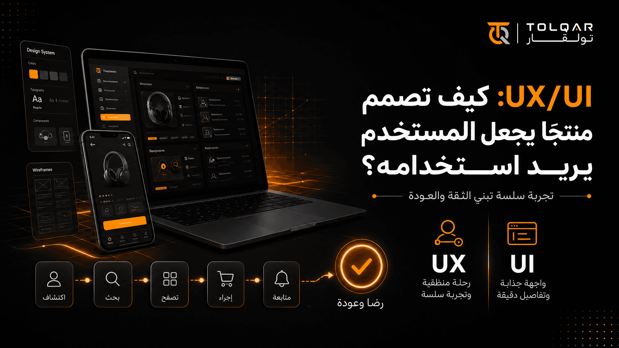
The difference between UX and UI that many confuse
UX (User Experience) = How the user feels while using it
Includes: Are the steps logical? Do they reach their goal easily? Do they feel frustrated or relieved while navigating?
UI (User Interface) = How the product looks visually
Includes: Colors, fonts, buttons, general visual layout.
A product with a very beautiful UI but a bad UX = A luxury building with a confusing interior layout, the visitor admires the look but gets lost inside and leaves frustrated.
Why UX is more important than UI even though people notice UI first?
The user judges the appearance within seconds, but decides whether to return or not based on their actual experience during use. A beautiful product with a frustrating experience loses its users quickly, while a visually simple product with a seamless experience builds real loyalty over time.
5 principles we apply at TOLQAR when designing any product
Principle one: Minimize the number of steps for any goal
Every extra step between the user and their goal increases the likelihood of them abandoning the attempt. Always ask: Can I delete this step or merge it with another?
Example from our store development service: We design the checkout process with the fewest possible steps (product selection, payment, confirmation) instead of adding complex mandatory registration steps that make the customer back out before completing the purchase.
Principle two: Make the system anticipate the user's need
The user does not like to think too much during use. The more the system anticipates their next step and makes it easier for them, the more comfortable the use becomes.
Example: In our AI agent automation service, the agent suggests potential answers based on the conversation context, instead of making the user type their question from scratch every time.
Principle three: Visual consistency builds automatic trust
When the same visual patterns (button shapes, colors, spacing) are repeated across all screens, the user learns to expect the system's behavior without conscious thought, which creates a sense of comfort and professionalism.
This is exactly what our Visual Identity Design service provides — a unified system of colors and fonts used consistently across every subsequent design, whether a website, app, or marketing material.
Principle four: Design for error states, not just the ideal state
Many designs focus only on the "happy path" (everything works right), and ignore what happens if the user makes a mistake or an outage occurs. Designing clear and helpful error messages (not just "something went wrong") significantly reduces user frustration.
Principle five: Test with real users, not internal assumptions
The biggest design mistake is relying on "I think the user will understand this" without actual testing. Even a simple test with 5 people from your target audience reveals problems you would never have expected.
Signs indicating a poor user experience
Monitor these indicators in your current product if they exist:
| Sign | What it means |
|---|---|
| Users abandoning the form halfway | Too many or unclear steps |
| Frequent questions about "How do I do this?" | The interface is not self-explanatory |
| Low user retention rate | The experience does not create enough value to be worth returning to |
| Frequent complaints despite the system working technically without errors | The problem is in the experience, not the function itself |
Practical example: How do we improve a bad experience for an existing product?
Imagine an appointment booking app suffering from many users abandoning the booking process halfway through. Instead of guessing the reason, we apply this sequence:
Step 1: We observe exactly where most users stop (a specific screen, a specific field).
Step 2: We directly ask a sample of users why they stopped at that point.
Step 3: We simplify or rearrange that specific step, instead of redesigning the entire app.
Step 4: We measure whether the completion rate actually improved after the modification, or if we need an additional adjustment.
Frequently Asked Questions
Is UX/UI necessary from the first version (MVP) or can it be postponed?
Basic UX (clarity of steps, ease of reaching the goal) is necessary even in an MVP. Visually polished UI (fine aesthetic details) can be improved gradually after proving the idea.
How much does professional UX/UI design cost?
It depends on the number of screens and the level of complexity, and pricing details can be reviewed directly on our UI/UX design service page.
Do I need a UX designer separate from a UI designer?
In large projects yes, but in most small and medium projects, a single experienced designer in both aspects is completely sufficient and saves additional coordination costs.
Conclusion
Visually appealing design attracts attention for seconds, but thoughtfully designed experience is what builds a continuous relationship with the user. At TOLQAR, we apply both aspects together in every project — because one without the other gives an incomplete result.
Next Step
After you design an excellent experience, the final question in the series: How do you turn this successful product into a scalable product for growth? Read our latest article in the series: From Launch to Growth: How to Make Your Product Scalable?
Ready to design an experience that makes your users come back willingly? Browse our UI/UX design service at TOLQAR and see how we actually apply these principles in our projects.